© Jose Quintero / USA TODAY NETWORK via Imagn Images

Audio By Carbonatix
Major League Baseball has been played dating back to 1869 when the Boston Red Stockings beat the Philadelphia Athletics by a score of 6-5 in the City of Brotherly Love. Since, much has changed.
Franchises have come and gone. Teams have been relocated. Logos have been redesigned.
Today, there are 30 clubs across six leagues in the MLB. Each owns a look specific to both its baseball history and home city.
Ranking The 12 Best Hats In The MLB
Here, we’ll take a look at some of the best caps in the league. Keep in mind that these rankings are not fact. Much is personal preference in color choice, lettering, and logo size.
I tend to lean more traditional. Often, the simplest design can stand out amongst the rest. I’m also a sucker for the script, which would likely show through a bit more in a jersey logo list.
For now, we’ll stick with the hats. This list refers only to the classic look that’s typically seen on gameday. No throwbacks. No alternates. With that said, let the debate begin!
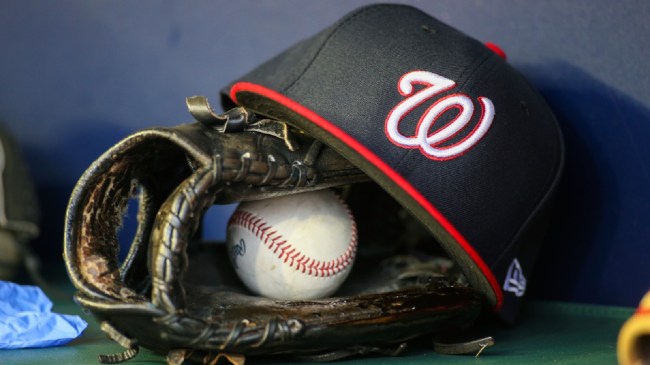
12. Washington Nationals
© Brett Davis-Imagn Images
I almost went rogue at No. 12 and took Toronto. The Blue Jay + Maple Leaf combo is a good one. It feels retro yet current. But, as I mentioned before, I’m a sucker for the script.
The Nationals moved to D.C. in a transition from the Montreal Expos. They’ve used the script “W” on their hats since 2005.
The white lettering looks great on either a red or blue cap. The cursive pops, as does the size of the logo. Unfortunately, there haven’t been many other “Ws” for the Nationals of late. After winning a World Series in 2019, they’ve posted five straight losing campaigns.
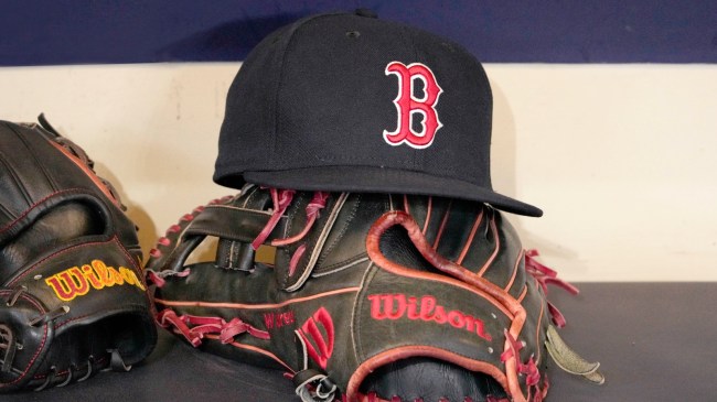
11. Boston Red Sox
© Michael McLoone-Imagn Images
It’s one of the oldest and most recognized hat logos in the game. Some variation of the club’s “B” has been around since the 1930s.
Initially, the team used a single sock logo similar to what can often be spotted on the Boston jerseys. It was quickly replaced by the single letter.
The red “B” is now outlined in white, which keeps the colors from clashing. The cap has been donned by Hall of Famers like Ted Williams and Carl Yastrzemski, and is one of the most popular hats in the MLB.
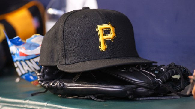
The Best Hats in the MLB: 10. Pittsburgh Pirates
© Brett Davis-Imagn Images
Black and gold are synonymous with sports in the Steel City. The Pirates are keeping with tradition in their uniform designs.
Pittsburgh’s “P” has been around since the early 1900s, although it began as white lettering on a blue cap. The white turned to red in the 1920s before the color design switched to the current black and gold in 1948.
While they did toy with striped caps and mustard yellow pill-box styles, they eventually reverted back to all black look. Since, it’s become a fan favorite.
9. Chicago Cubs
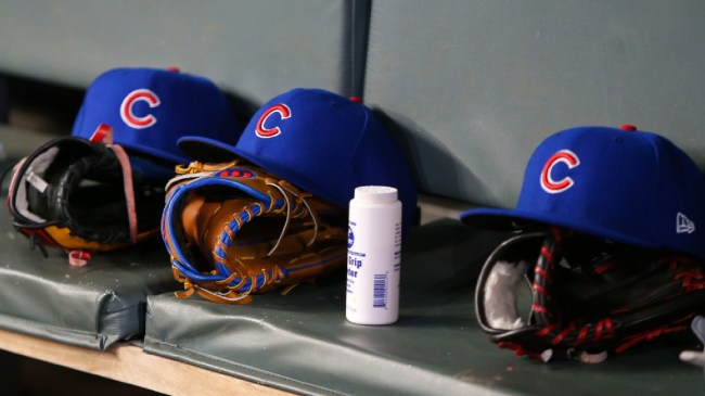
© Brett Davis-Imagn Images
The Chicago cap is the definition of classic. A simple “C” set on a light blue backdrop. It’s clean and simple, yet boasts history and is easily recognized.
The Cubs’ past logos have also included a bear at times, but the current look, at least for the hats, is just the single “C.” The shaping of that “C” has also shifted over the years from a Cincinnati Reds-type look to the rounder shape.
Personally, I’d like the lettering to be a bit bigger. It’s my main qualm with the design. Overall, it’s still one of the league’s tops.
8. Philadelphia Phillies
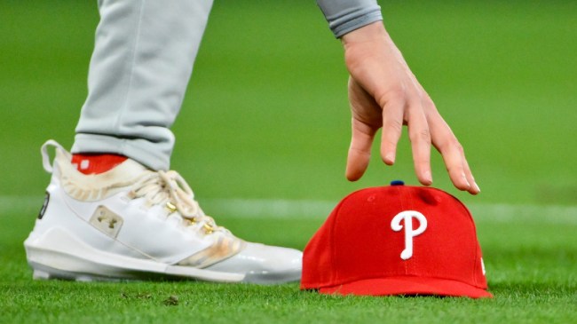
© Jeff Curry-Imagn Images
The Philadelphia “P” makes the list a few spots ahead of Pittsburgh’s giving the Phillies bragging rights in the state of Pennsylvania.
The Philly version of the “P” originally resembled more closely the Pirates’ current version. It was blocky as opposed to round.
The current lettering was introduced in the 1940s, though it later shifted to what would now be considered the retro look of the 70s and 80s. It returned to the old style in the 90s.
7. Atlanta Braves
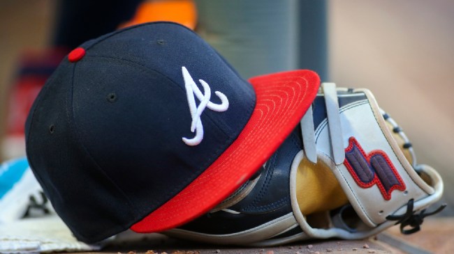
© Brett Davis-Imagn Images
One of four notable “A” designs in the MLB, the Braves make the list at No. 7. The white script lettering on the dark blue hat with a red bill is hard to beat.
There have been changes on the cap throughout the years following a move from Milwaukee. Though the franchise started its move to Atlanta with the look seen on today’s hats, it briefly switched to a lowercase “A” in the early 1970s.
The Braves returned to the capital script in the 80s which has stuck though, at times, with the addition of a tomahawk.
6. St Louis Cardinals
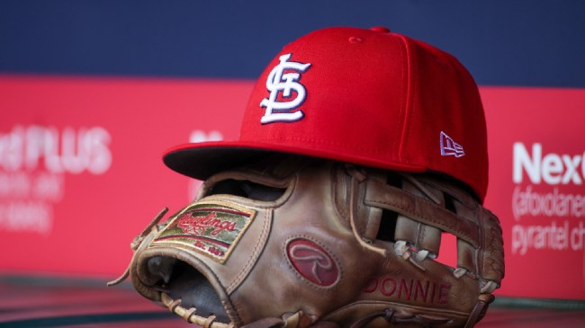
© Brett Davis-Imagn Images
The Cardinals’ look is unique in the sense that is combines three letters of different sizes to form the main logo. Most on this list will see one, maybe two letters on the front of the cap.
St. Louis is one of the oldest and most successful franchises in the MLB. The team’s been in the same city since its inception in the 1880s.
For the majority of their existence, the Cardinals have used some form of the interlinked STL. At some points in the 1940s, an image of a cardinal was used. The current style continues to be the best in the National League Central.
The Best Hats in the MLB: 5. Athletics
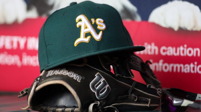
© Brett Davis-Imagn Images
The A’s are in the process of moving to Las Vegas after more than 50 years in Oakland. That green and yellow cap isn’t expected to change, though.
Some form of the current “A” has been in the franchise’s main logo dating back to its time in Philadelphia and Kansas City, although it was initially accompanied by an elephant.
Since 1968, we’ve seen the current look. The “A” replaced the “KC” that was seen in Kansas City. Now, the green and gold is a staple and one of the best looks in the game.
4. Chicago White Sox
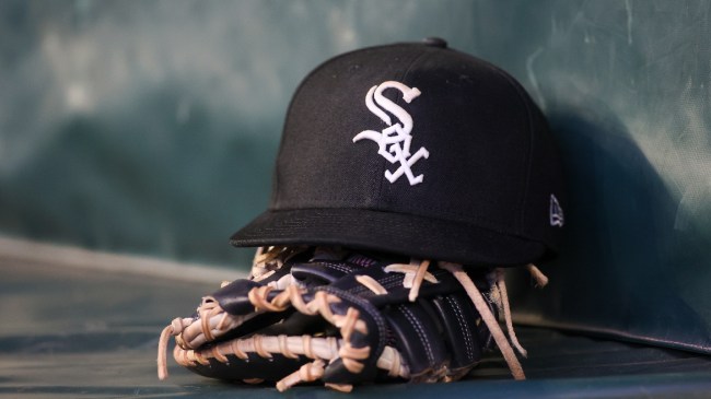
© Brett Davis-Imagn Images
A second team from Chicago comes in at No. 4 of this 12-squad list in the White Sox. The South Siders’ style differs vastly from that of the Cubs.
The White Sox use a combination of curves and angles to spell out “Sox.” Like St. Louis, the hat logo uses three interlinked letters, and though there’s a bit more going on, it works. The black and white look is sleek and clean.
Initially, the club used a single “C” as the logo. The first image of the “Sox” lettering came in the 1910s, though it consisted of the “o” and “x” being on either side of the “S” curvatures.
The current design was introduced in the early 90s and it’s stuck.
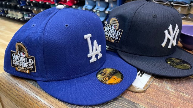
3. Los Angeles Dodgers
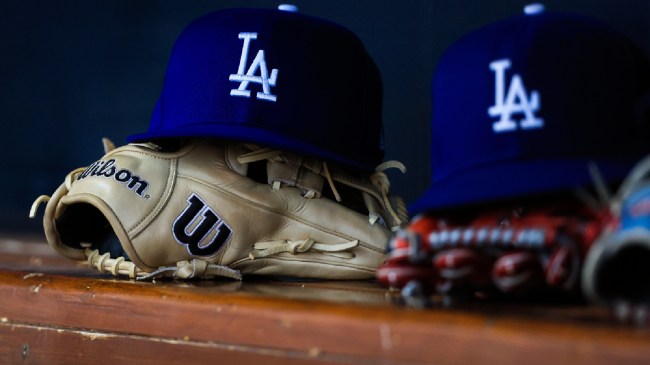
© Katie Stratman-Imagn Images
The intertwining LA is the most recognizable hat logo in the National League. Past and current success has played a major role in its popularity.
The white lettering on the blue cap is nothing short of magnificent. It pops, grabbing your attention almost instantly.
The block LA is a classic look that’s been worn by superstars in the nation’s largest market. It’s a look that’s been used by the team since its move from Brooklyn in 1958.
2. New York Yankees
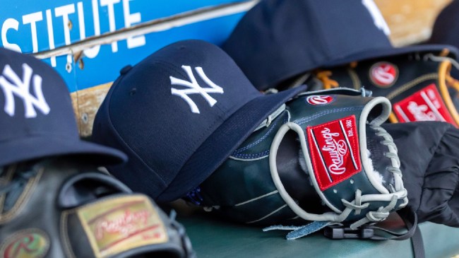
© David Reginek-Imagn Images
New York has the most recognized, popular, and historic logo in all of baseball, and maybe in sports. The interlocking “NY” is worn all over the world.
The club’s 27 titles play a role in that popularity with the pinstripes far and away the most accomplished franchise in MLB history.
The “NY” is much different than the official team logo, which displays a bat wearing a top hat with the word “Yankees” written over the background of a baseball. The hat design has a lot less going on – in a good way!
Not much has changed over the years. The “NY” logo was adopted by the team in the early 1900s, originating from a New York City Police Department medal of valor.
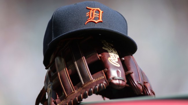
And the Best Hat in the MLB is… the Detroit Tigers
© Brett Davis-Imagn Images
The Yankees may be the most popular, but it’s the Tigers that own baseball’s best hat. The Detroit “D” has been around since 1905, and while the design has shifted here and there, it’s remained largely the same.
The team’s first logo was a Tiger, used for only a few seasons before the “D” made its way to the hat. The original lettering looked much like what we see today.
The Tigers moved to a rounder, more basic “D” in the 1910s, and then to a block “D” in the 1930s. On each occasion, though, they returned to the current style.
The only significant change since 1934 was the addition of a tiger crawling through the lettering in the mid-90s. The look that’s now worn was reintroduced in 1998 and continues to be used today.